Figma template
Introduction
This Figma template file is designed to help you create and customize forms that can be converted into functional web forms using Figma Forms. It includes pre-designed components and layouts that you can easily modify to fit your needs.
The template is structured to align with the DÁP design system, using its components and layout guidelines.
Figma template file
Get the template from Figma Community.
DÁP design system
Learn more about DÁP design system.
Form Structure
Figma Forms was built for multi-page forms, so use the structure below when designing your forms.
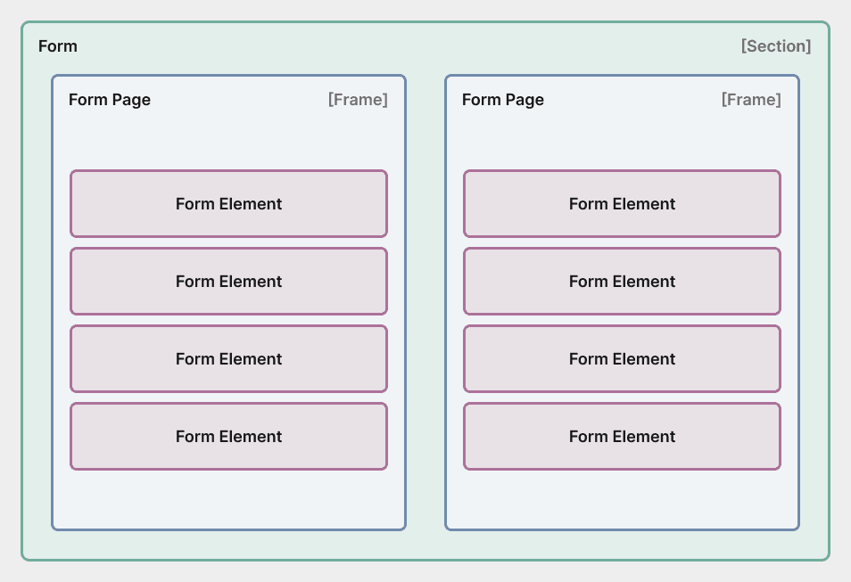
Form
The collection of your form pages, represented by a Section.
The page order is determined by the order of the frames within this section.
When using the parser, pass the node ID of this Section to extract the form data.
Name the section as follows to give your form a name and a description:
# Format
{Form Title};{Form Description}
# Example
Customer Feedback Form;Please fill out this form to help us improve our services.
This naming convention is currently required for the parser to identify the form's title and description. In a later version it will be replaced by a component, but for now, please use the above format.
Make sure that the Section only contains Form Pages and no other elements, as this may lead to parsing errors.
Form Page
The individual pages of your form, represented by Frames within the Form section.
Name the frames as follows to give your form pages a title and a description:
# Format
{Page Title};{Page Description}
# Example
Personal Information;Please provide your personal details.
Make sure that each Form Page frame only contains the predefined Form Elements and no other elements, as this may lead to parsing errors.
Form Elements
The actual form fields and components, grouped within each Form Page frame.
Currently Figma doesn't have a React-like children feature (placing any component into another one), so some elements cannot be components, such as Radio/Checkbox groups or fieldsets. Generally, copy/pasting is the recommended way to go, but some elements are available also in the assets panel.
Figma has already announced the so called Slots feature, which will allow nesting components. Once this feature is available, we will update the template and documentation accordingly.
Make sure to not rename the elements, as the parser relies on their names to identify them correctly. Once Figma introduces the Slots feature, we will update the parser to depend on component ids instead of names.
Label
Standalone label component.
Text field
Text input field component.
Number field
Numeric input field component.
Textarea
Multi-line text input component.
Dropdown
Dropdown selection component.
Radio group
Single-choice radio button group.
Checkbox group
Multiple-choice checkbox group.
Fieldset
Group related form fields together.