Radio Group
Used to create a group of radio buttons. Has a label (optional) and contains one or more radio button components.
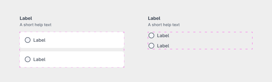
Place the radio buttons into the radio-button-group-container frame within the radio-button-group element.
Parsed properties:
| Property | Value | Description |
|---|---|---|
| Elements | Radio button components | The radio buttons placed within the container frame. |
| Label properties | N/A | See Label for details. |
Radio button variants
Default
The default DÁP radio button component.

Parsed properties:
| Property | Value | Description |
|---|---|---|
| Background | True/False | Whether the radio button has a background. |
| Label properties | N/A | See Label for details. |
Text field
A radio button with an associated text field. The text field is only active when the radio button is selected.
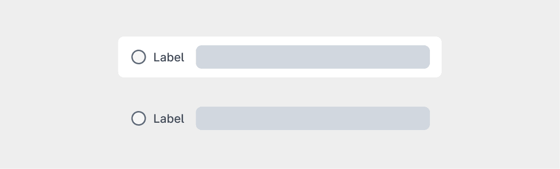
The parsed properties are the same as the default radio button.
Textarea
A radio button with an associated textarea. The textarea is only active when the radio button is selected.
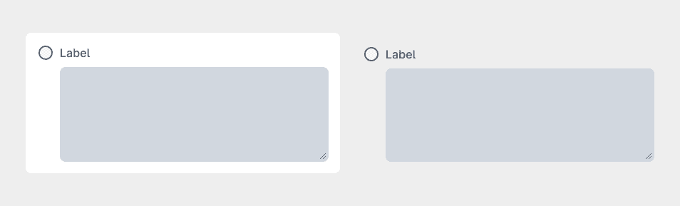
Additional parsed properties:
| Property | Value | Description |
|---|---|---|
| Character count | Number | The maximum number of characters allowed in the textarea. |
Number field
A radio button with an associated number field. The number field is only active when the radio button is selected.
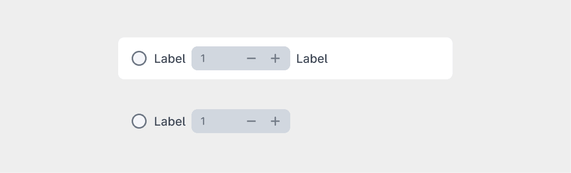
Additional parsed properties:
| Property | Value | Description |
|---|---|---|
| Field position | front/middle/back | Position of the number field relative to the radio button |
| Front label | Text | Label displayed in front of the number field. |
| Back label | Text | Label displayed after the number field. |
Extendable
A radio button with an associated container. The items within the container are only visible when the radio button is selected.
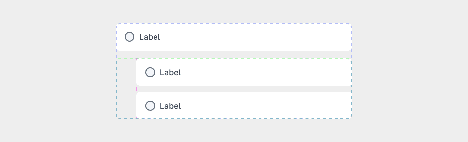
Place the items into the radio-button-extendable-container frame within the extendable-radio-button element.
- Fieldset
- Checkbox Group
- Radio Group
Make sure to place only the above mentioned components into the container, and only one component at a time. If you want to place multiple components, wrap them in a Fieldset first.
Additional parsed properties:
| Property | Value | Description |
|---|---|---|
| Extendable content | Fieldset/Radio Group/Checkbox Group | The component placed within the extendable container. |