Checkbox Group
Used to create a group of checkboxes. Has a label (optional) and contains one or more checkbox components.
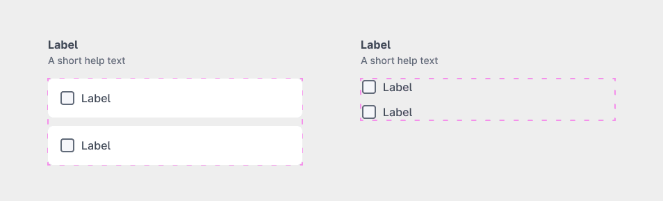
Place the checkboxes into the checkbox-group-container frame within the checkbox-group element.
Parsed properties:
| Property | Value | Description |
|---|---|---|
| Elements | Checkbox components | The checkboxes placed within the container frame. |
| Label properties | N/A | See Label for details. |
Checkbox variants
Default
The default DÁP checkbox component.
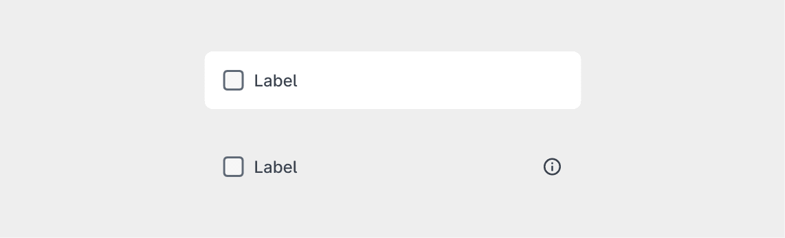
Parsed properties:
| Property | Value | Description |
|---|---|---|
| Background | True/False | Whether the checkbox has a background. |
| Label properties | N/A | See Label for details. |
Text field
A checkbox with an associated text field. The text field is only active when the checkbox is checked.
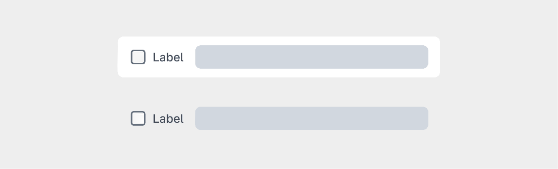
The parsed properties are the same as the default checkbox.
Textarea
A checkbox with an associated textarea. The textarea is only active when the checkbox is checked.
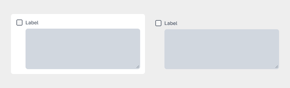
Additional parsed properties:
| Property | Value | Description |
|---|---|---|
| Character count | Number | The maximum number of characters allowed in the textarea. |
Number field
A checkbox with an associated number field. The number field is only active when the checkbox is checked.
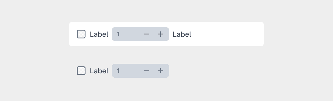
Additional parsed properties:
| Property | Value | Description |
|---|---|---|
| Field position | front/middle/back | Position of the number field relative to the checkbox label. |
| Front label | Text | Label displayed in front of the number field. |
| Back label | Text | Label displayed after the number field. |
Extendable
A checkbox with an associated container. The items placed within the container will be shown only when the checkbox is checked.
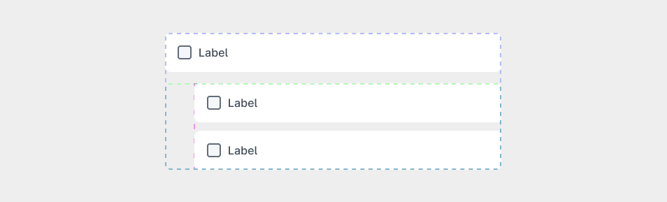
Place one of the following components into the checkbox-extendable-container frame within the checkbox-extendable element:
- Fieldset
- Radio Group
- Checkbox Group
Make sure to place only the above mentioned components into the container, and only one component at a time. If you want to place multiple components, wrap them in a Fieldset first.
Additional parsed properties:
| Property | Value | Description |
|---|---|---|
| Extendable content | Fieldset/Radio Group/Checkbox Group | The component placed within the extendable container. |