Dropdown
The default DÁP dropdown component with an attached droplist container, in which any number of droplist items can be placed.
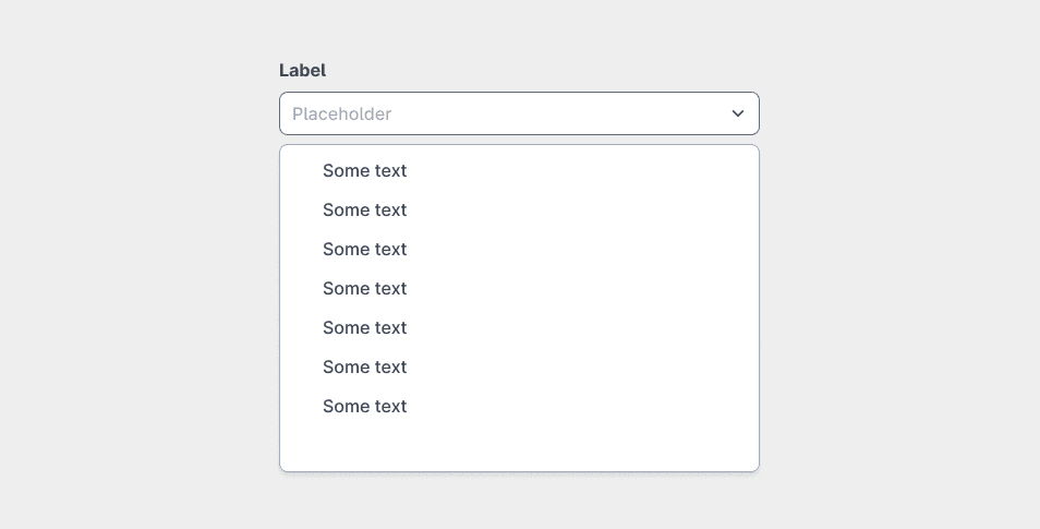
Place the droplist items into the droplist-container frame, which should be a child of the dropdown element.
Parsed properties:
| Property | Value | Description |
|---|---|---|
| Content | None/Text/Placeholder | The initial or placeholder value of the dropdown. |
| Content value | Text | The text value in the dropdown. |
| Filterable | True/False | Appear as a select or a combobox. |
| Width | Full(1024)/Custom | Sets the width of the dropdown. |
| Elements | Droplist item components | The text of each droplist item placed within the droplist container. |
| Label properties | N/A | See Label for details. |
If you set an initial value for the dropdown, make sure that the corresponding droplist item exists within the droplist container.